Adventures in Koha
For class, I have been exploring Koha as a potential alternative to Follett Destiny. I am not 100% certain that it would be worth switching, but I gotta say… Koha is pretty cool! In the process of doing a school project where we had to argue for a new OPAC (Online Public Access Catalog), I may have legitimately convinced myself.
First of all, it’s open source and free. What says library more than that?! I love the idea of a community all engaged in the development of this program, which in turn serves libraries and thus even larger community. So in terms of values, I’m already on board. But what’s the functionality like? In order to really get a sense for it I played around for an afternoon in a demo version.
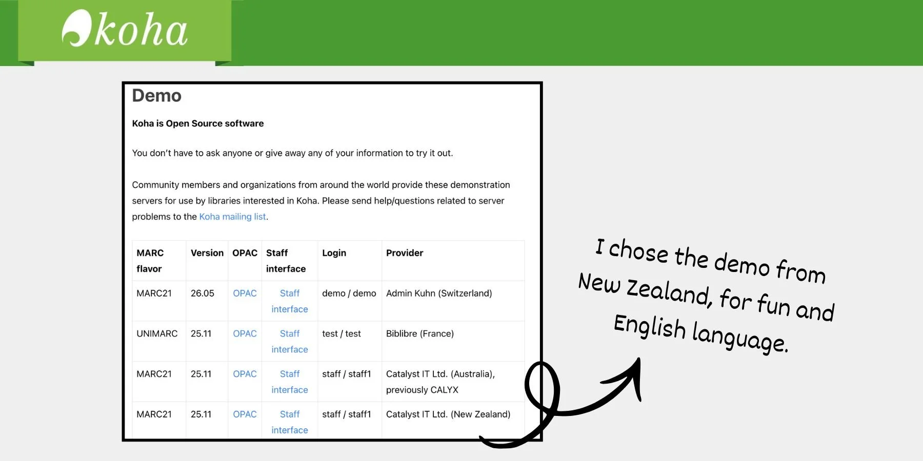
Here’s what I discovered
1. Navigation behind the scenes is mostly great.
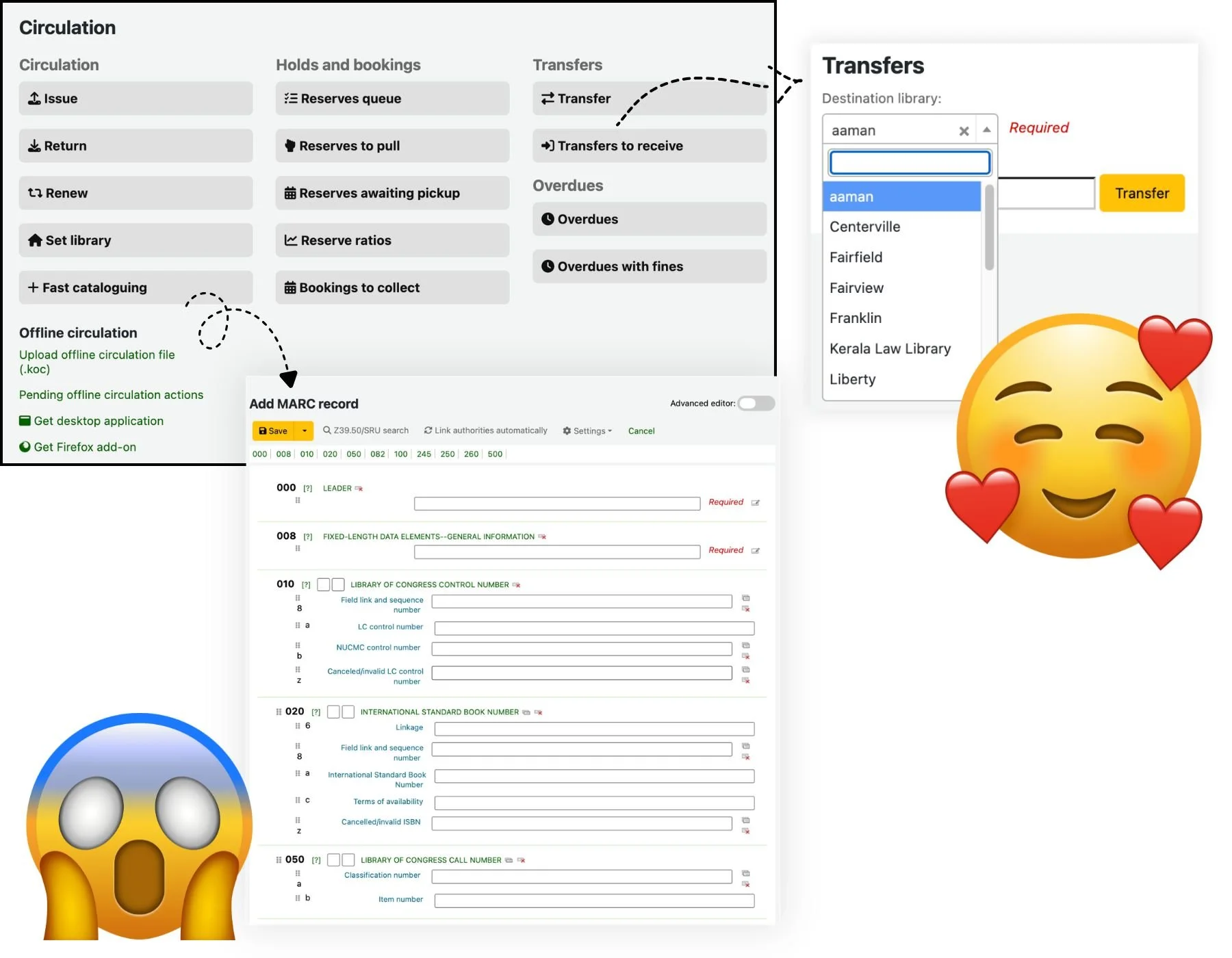
Transfers
It looks like you can not only set up easy transfers between libraries, you can also get notified when they are ready and track how many books you have out at other libraries. Extremely useful.
Cataloging looks like a nightmare
I suspect I would find work arounds and/or get the hang of it, but, I don’t know…”fast cataloging” taking me to a straight up MARC record template just about broke me.
Acquisitions tracking looks amazing
In Follett Destiny you can really only track the orders you’ve made with Follett (Follett Titlewave). It may be difficult to set up and not work as beautifully in real life, but I am intrigued by the option to look up and track orders by different vendors all in one place.
So many customization opportunities
At this point my head was swimming a bit, but I can tell that once you learn your way around the customization options are likely much more flexible than in Follett.
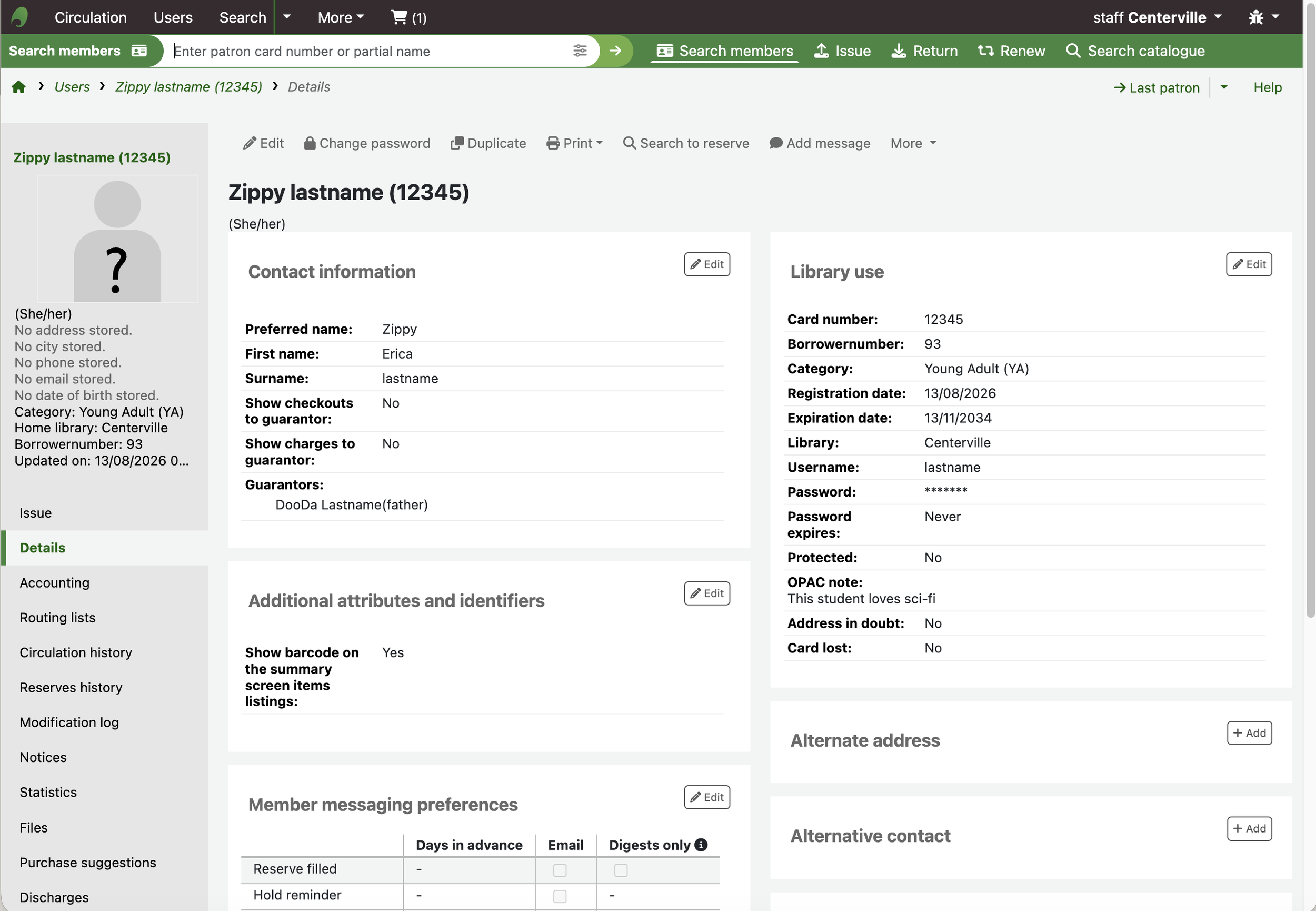
2. How to add a user.
Enter: Erica Lastname, preferred name “Zippy.” Child of DooDa Lastname. Pronouns she/her. Keep an eye out for her as we go forward.
3. How to make cover images display AND how to add them to a record.
I was concerned that I didn’t see any cover images, and then I did a little googling and discovered that the settings just weren’t turned on yet in this particular demo. There are options for pulling cover images from a variety of places, and options for when they are displayed. Once the correct switch was flipped, it was also extremely easy to add any jpg or png as a cover for the records that didn’t have any.
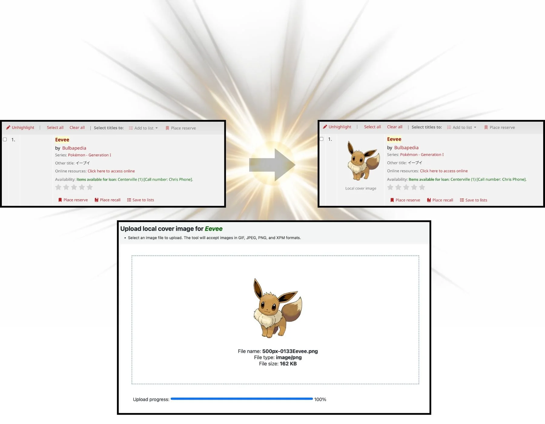
Phew!
4. User customization blew me away.
After messing around in the staff interface for a good long while, I pulled up the actual OPAC (what users would see) and logged in as Erica Lastname.
I loved it.
First of all, when I set up the patron account I listed “Zippy” as the preferred name. Not once was I referred to as Erica, I was only able to find out that information by navigating to the “personal details” tab in my account. Once in this tab, I as the student/user, was able to change any of the information myself. I updated my pronouns from she/her to they/them, and was notified that a librarian would review the changes.
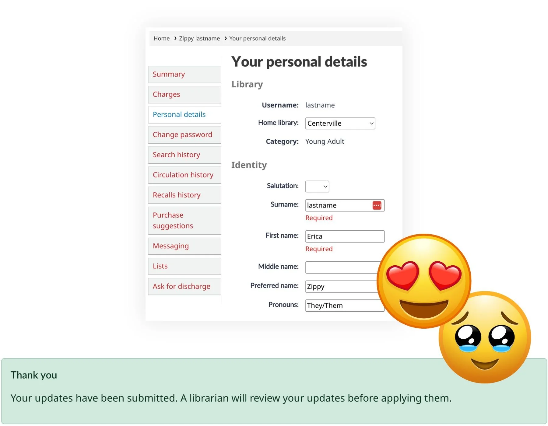
Hopped on over to the staff interface, got a notification, approved, and boom: new pronouns for Zippy.
Student control over their own information! A spot for pronouns in the first place!! Be still my heart.
I also had fun making lists and making suggestions for future purchases, all in the same platform.
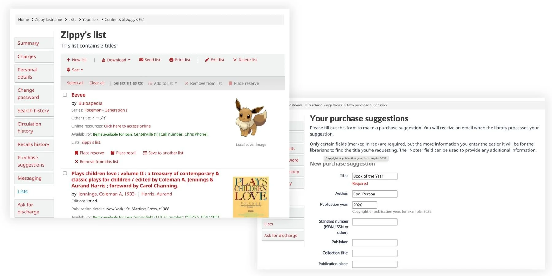
5. Searching for a book was a little overwhelming but I found the classic layout comforting (and discovered some cool features).
For the most part, I enjoyed the experience of searching for a book. It clearly told me where it was available, the call number, and some brief publication data.
When I first clicked into the record itself, I was a little overwhelmed. As a user, why would I want a MARC view? Why do I need to know both DDC classification and LOC classification?
But then…a citation button? Plus, a clear table of what kind of item it is, where to find it, call number, and availability? And the kicker. “Browse Shelf”.
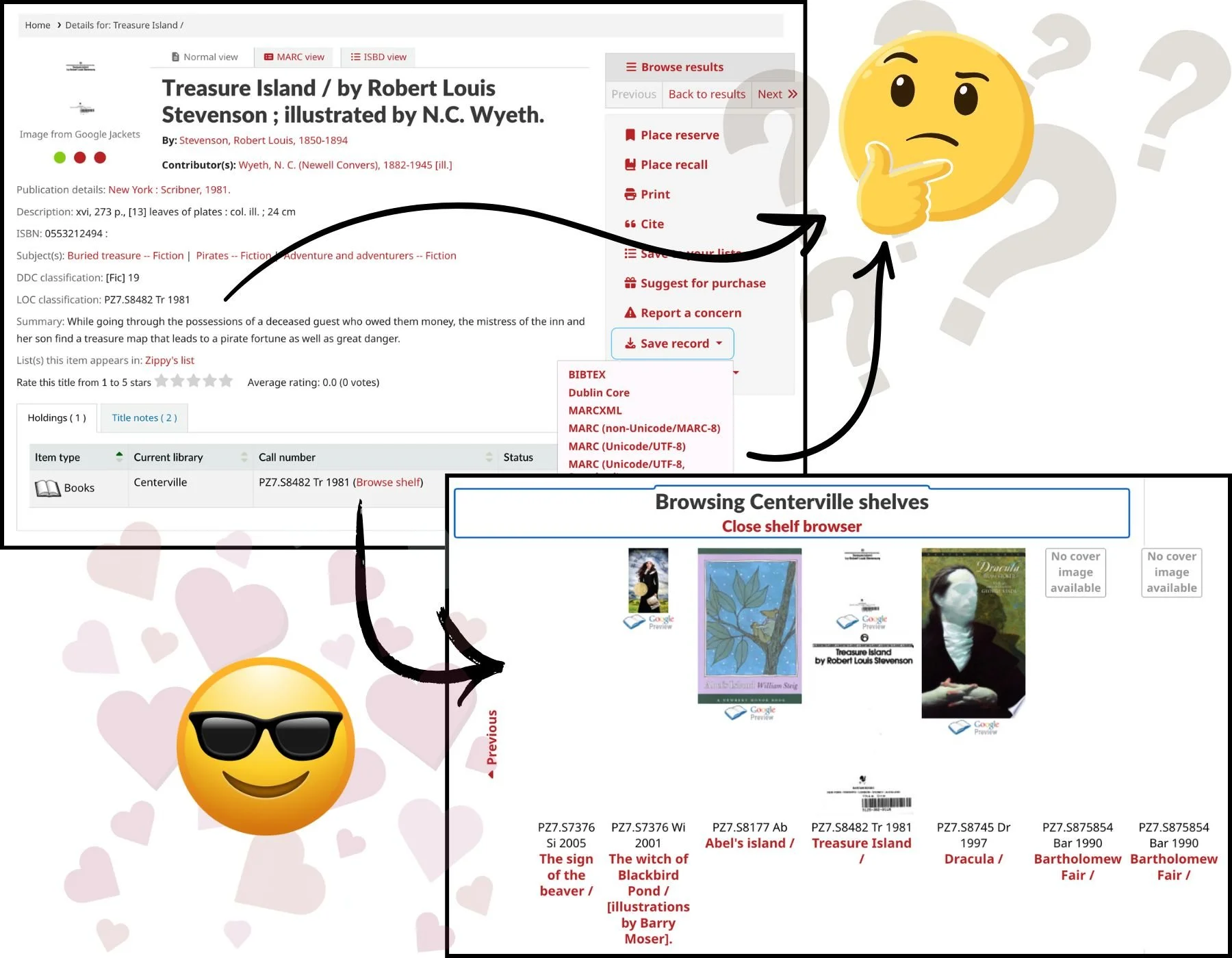
And this shelf browser delivered on its promise, displaying all the titles that would be shelved nearby. Being able to actually just browse, digitally, is so cool.
I know most people love the Destiny Discover student facing interface. I concede that it’s streamlined and shiny, but…it bothers me. I can’t quite put my finger on why! It’s certainly functional, but something about the aesthetic says to me “we care more about how we look than getting you the information you want.” For whatever reason, I can never find what I’m looking for in a given record. A small example of the Koha experience being better, for me, was realizing I could click on the series field and it would take me to ALL THE BOOKS IN THAT SERIES. Why does Follett not do that? This drives me nuts.
Conclusion? Sign me up!
(if someone will help me figure out how to do that)